Inkengineers
'For the Love of Art' annual report 10/11
Work 16
Client
Nanyang Academy of Fine Arts
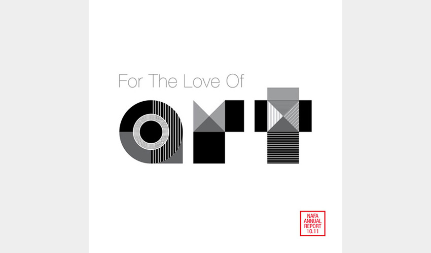
Designed as an art piece of visual juxtaposition, the 'art' on the cover is crafted in black and white contrasting graphics while vibrant colours await inside. Inspired by the artist's chop on traditional oriental art, NAFA's 'identity' is similarly styled, a nod to the school's distinctive mix of traditional and modern elements.
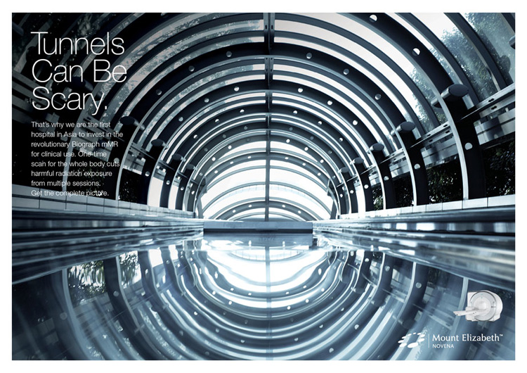
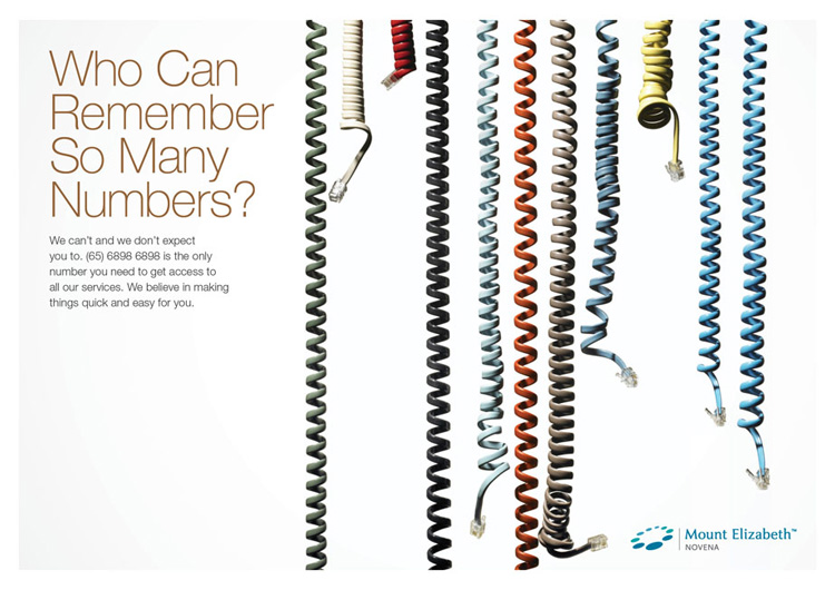
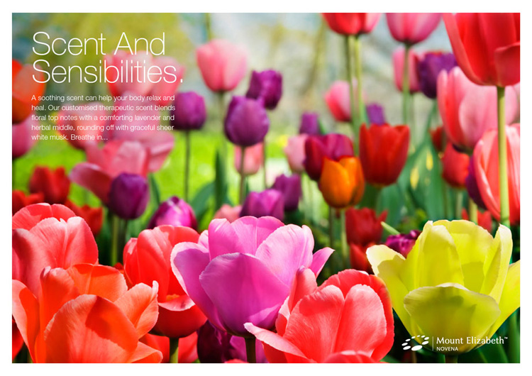
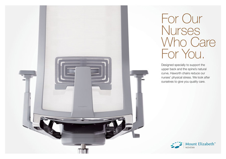
Pre-opening Campaign Postcards
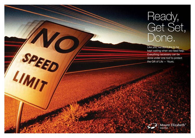
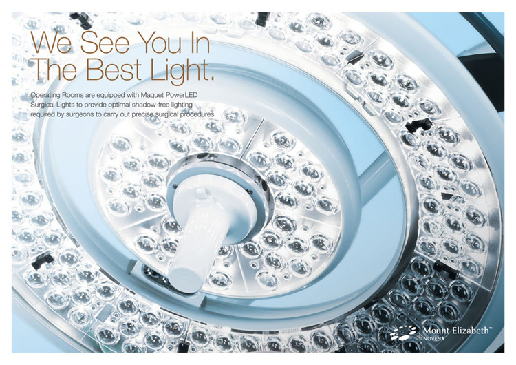
WORK 15


Client
Mount Elizabeth Novena Hospital, ParkwayHealth (Singapore)
A series of 9 postcards designed as part of Mount Elizabeth Novena Hospital's publicity campaign to announce its opening in July 2012. Using strong and unconventional images, clean design and catchy copy, the postcards successfully conveyed the hospital's key brand essence and were later adapted into electronic form for emailers and FaceBook.
A collaboration with Behaviour Design Office.
Retail Design & Fit-Out Guidelines
WORK 14
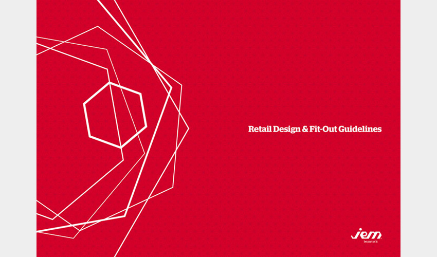
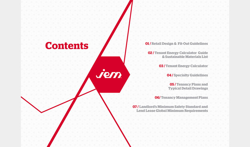
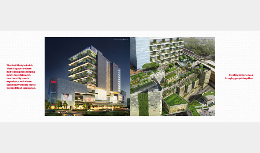


Client
Lend Lease Retail Pte Ltd
This electronic (pdf) Retail Design & Fit-Out Guidelines designed for jem™, a new mall in the heart of the new CBD in the west, is saved in a customised hexagon-shaped thumb drive and presented to tenants and their interior design teams. For easy reading, ample usage of space and imagery dividers break the monotony of the text while the use of corporate colours and graphics reinforce brand identity.
Japanese Film Festival 2008 Collaterals
WORK 13
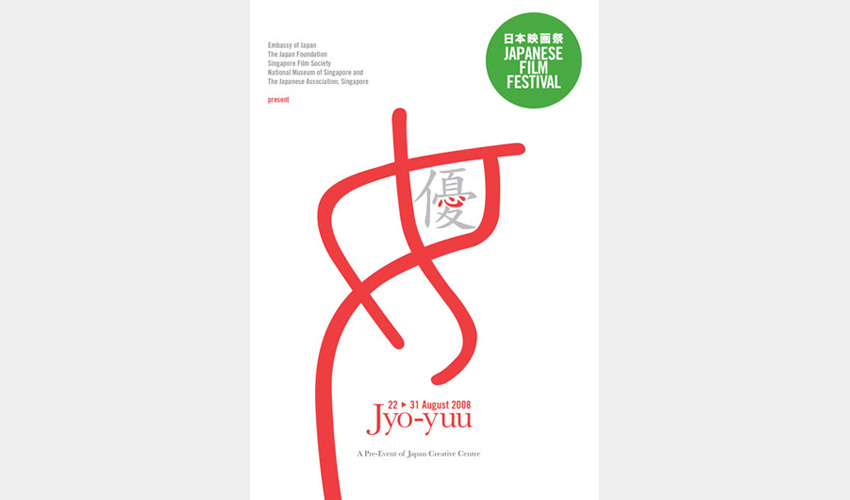
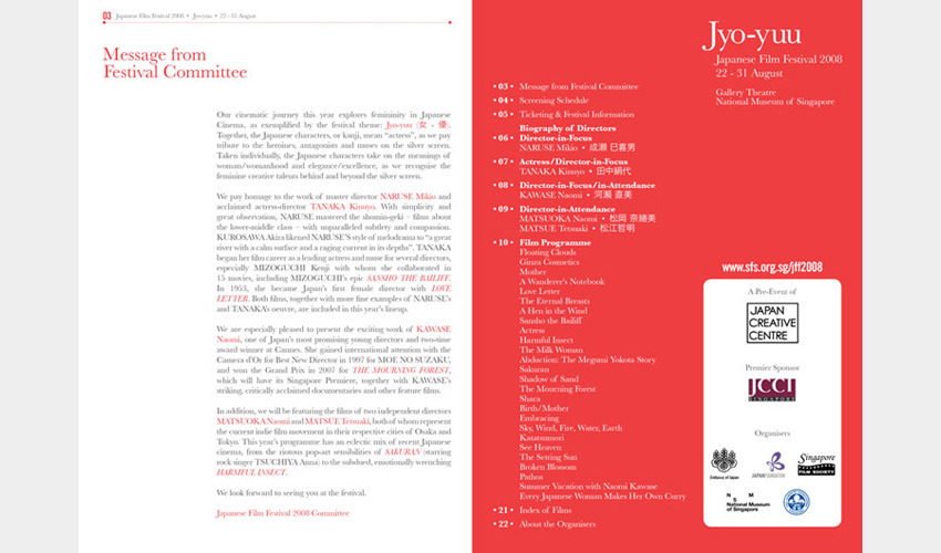
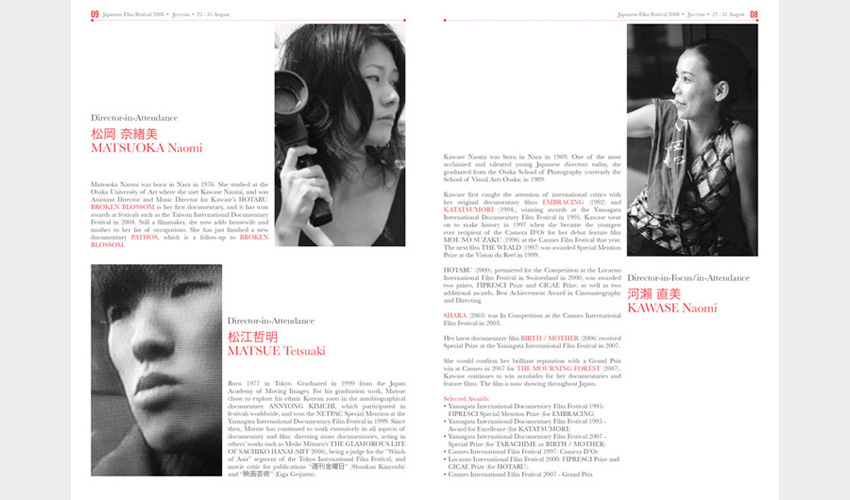
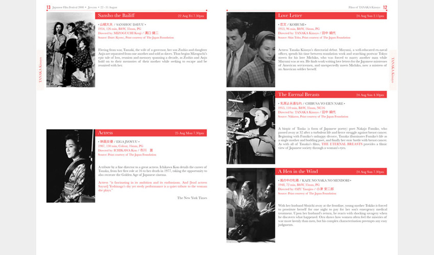
Client
Singapore Film Society
The festival theme 'Jyo-yuu' means 'actress' but when read individually, the Japanese characters represent 'woman/womanhood' and elegance/excellence. A stylized kanji font design plays up the character 女and emphasizes the character 心 to celebrate the feminine creative talents behind the silver screen while keeping to a simple colour scheme of red and white, symbolic of Japan.
Japanese Film Festival 2007 Collaterals
WORK 12
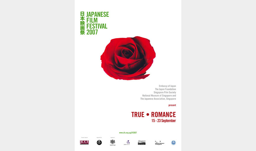
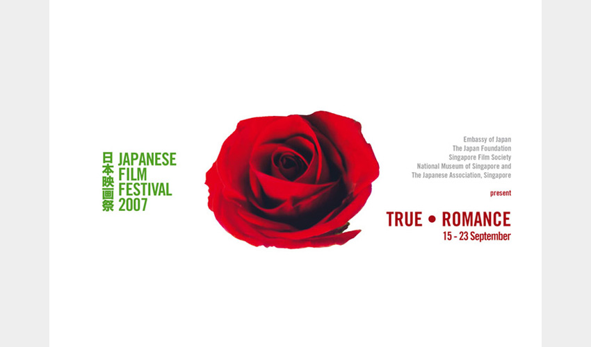
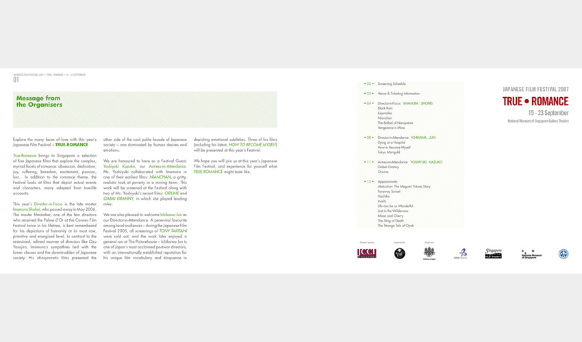
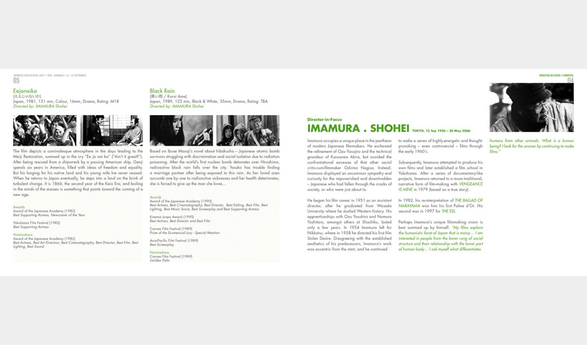
Client
Singapore Film Society
The festival's theme 'True Romance' explores the many complex myriad facets of love: obession, dedication, joy, suffering, boredom, excitement, passion, lust. Using a single deep red rose, the universal symbol of love and beauty, as its main visual against a landscape of white space, it is also a subtle symbol of the Japanese flag's red circle on white.
Great Singapore Sale 2010 campaign
WORK 11
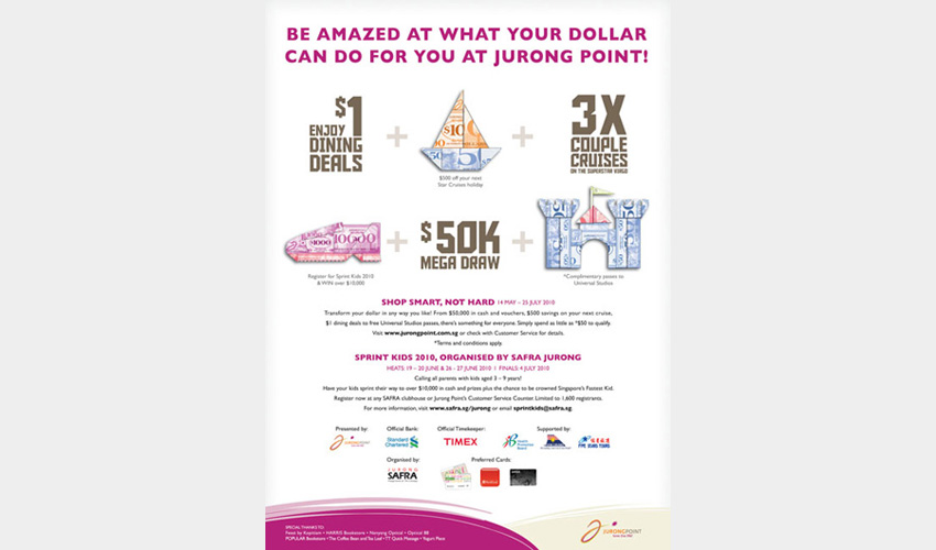
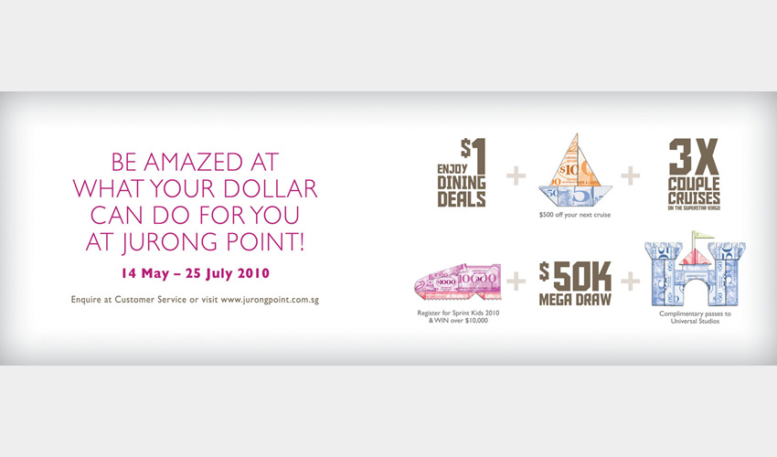
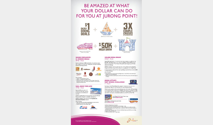
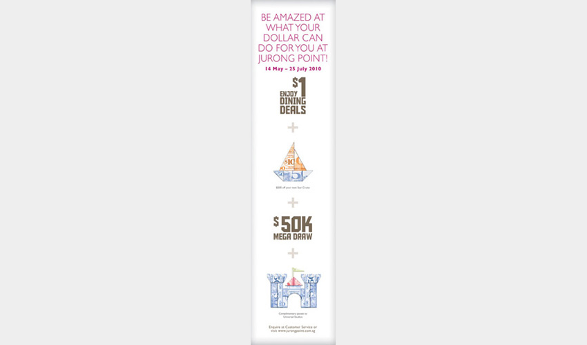
Client
Jurong Point
Using the $50K Mega Draw as the main draw, promo mechanics such as Star Cruise Getaway and tickets to Universal Studios are represented as icons made of origami dollar notes, denoting the great value that shoppers enjoy at Jurong Point. Collaterals include press ads and in-mall ads such as glass door stickers, pillar wraps, standee posters and railing banners.
Valentine's Day 2009 campaign
WORK 10
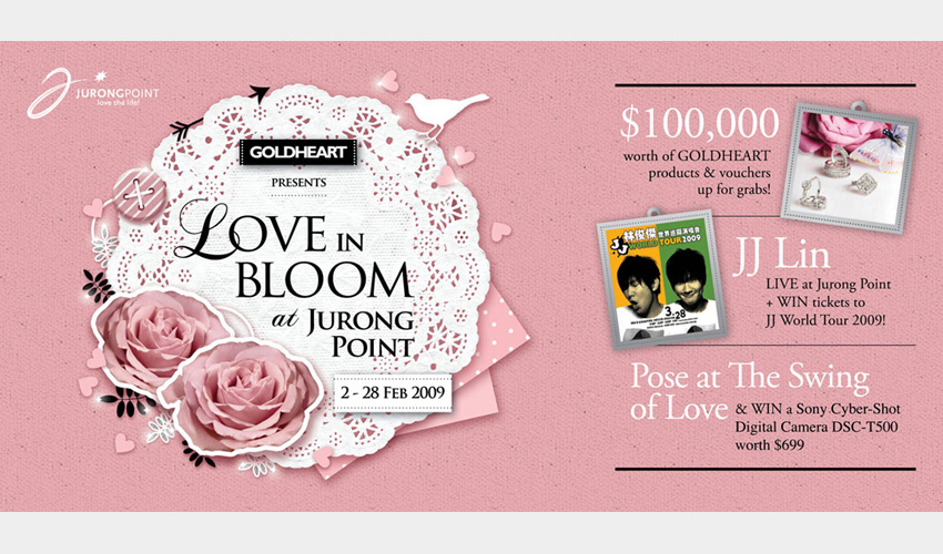
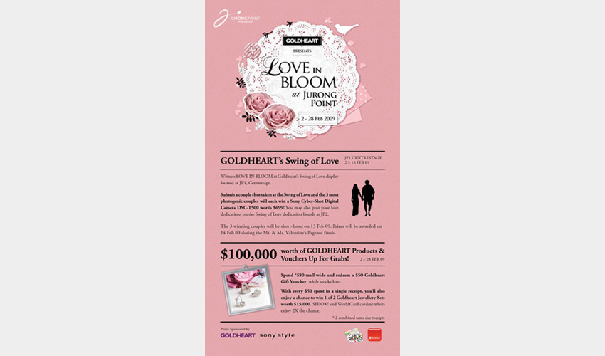
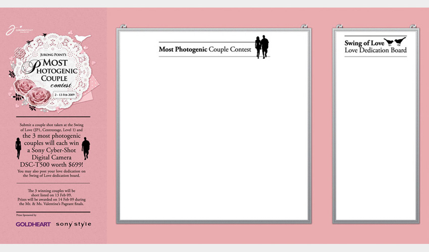
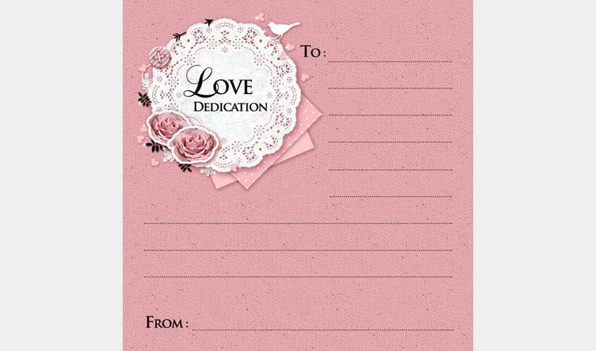
Client
Jurong Point
A combination of the colour pink and a collage of imagery and graphic icons brings out the sweet, lovey-dovey feel befitting for the occasion and tagline 'Love in Bloom at Jurong Point'. Collaterals include direct mailer, lift posters, wall stickers and voting card.
Open House 2012 Posters
WORK 9

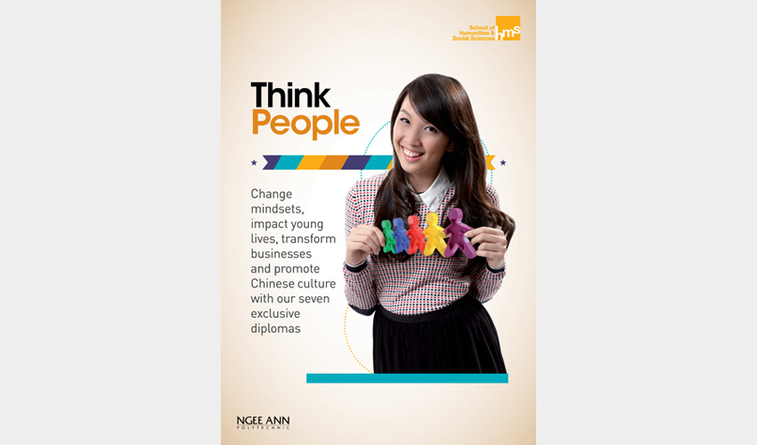
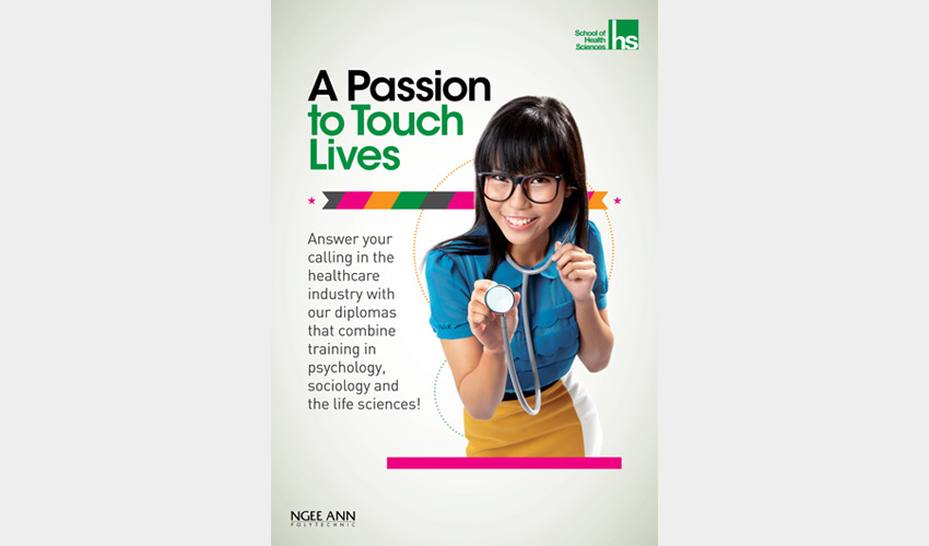
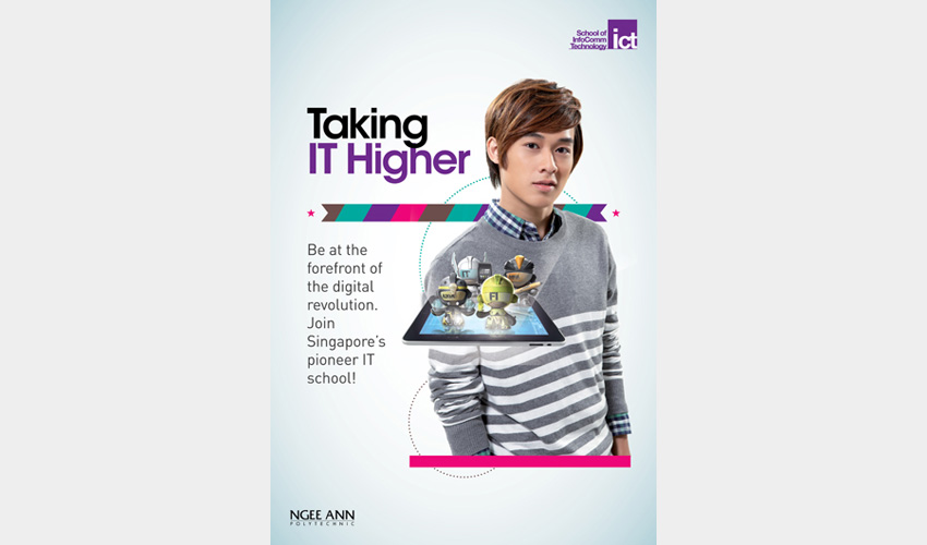
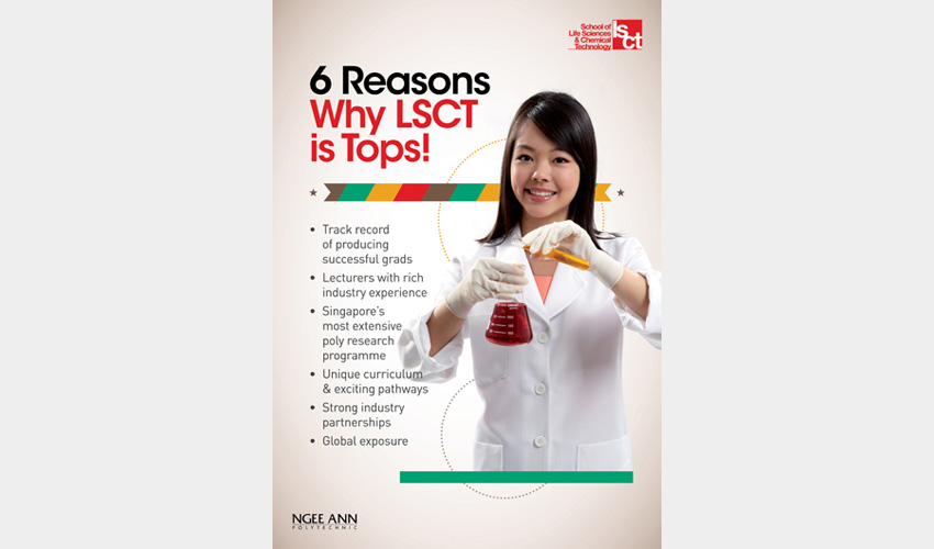
Client
Ngee Ann Polytechnic
A series of diploma course posters designed for Ngee Ann Polytechnic's Open House 2012, they play up the cheerful, vibrant images of students against a clean background with a strip of multi-coloured ribbon.
Print Ads (2010 - 2011)
WORK 8
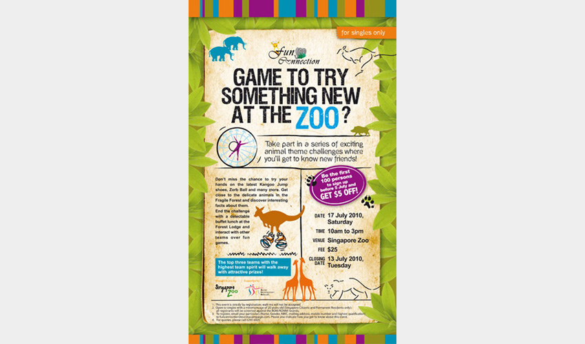
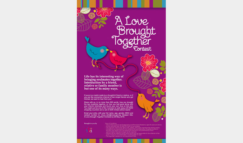
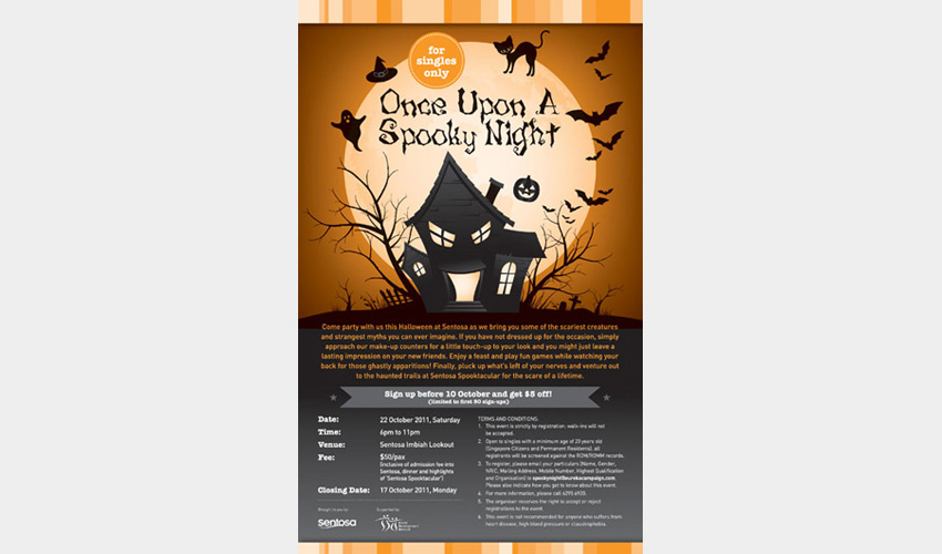
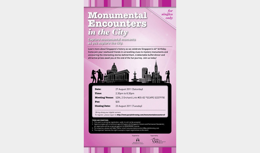
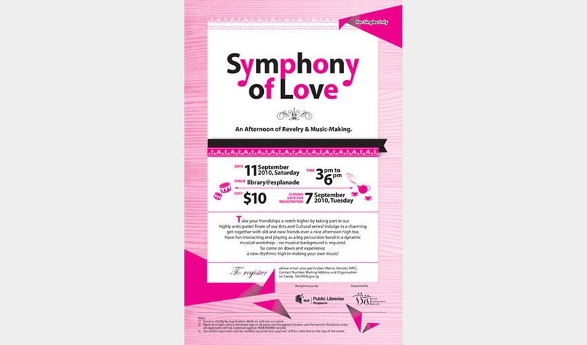
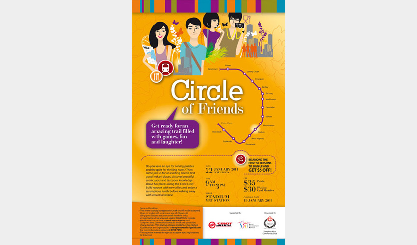
Client
Ministry of Community Development, Youth and Sports, Social Development Network
Featuring illustrations specially drawn to customise to each event, these press ads were designed for various singles events organised by Ministry of Community Development, Youth and Sports, Social Development Network from 2010 to 2011. Some ads were also adapted into magazine ads and featured in SDN's bi-monthly lifestyle publication, DUET.
Desktop calendar 2011
WORK 7
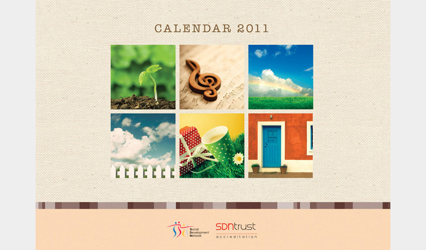

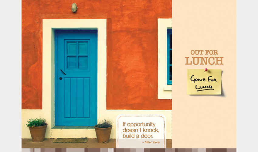

Client
Ministry of Community Development, Youth and Sports, Social Development Network
A desktop calendar with interesting dating tips, inspirational love quotes and quirky but practical office messages such as 'Out for lunch' and 'It's Friday! Time to party!'. It is designed with a combination of colourful images, warm earth hues and refreshing green to evoke a heartwarming feel.
Red Camp 5 campaign
WORK 6
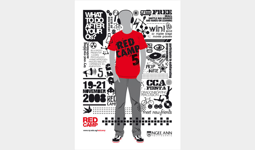
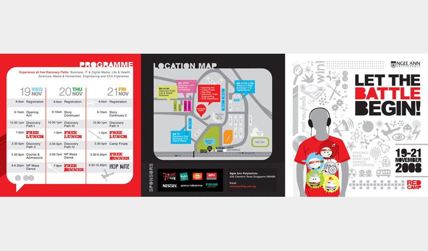
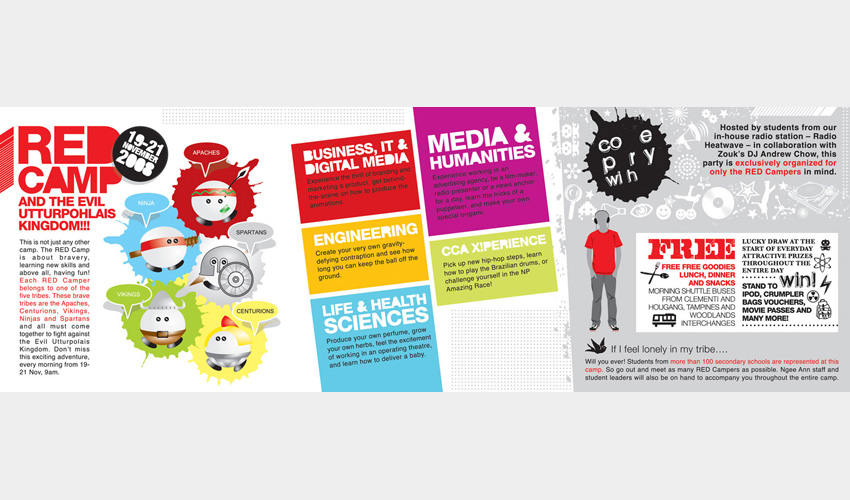
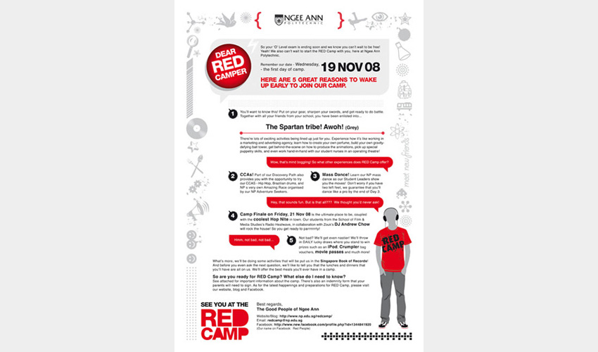
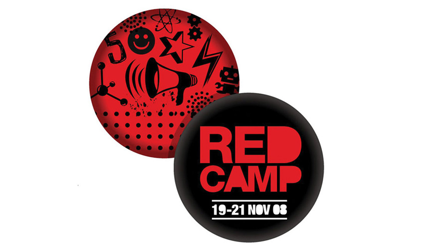
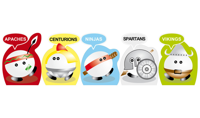
Client
Ngee Ann Polytechnic
An illustration of a camper at Red Camp, an annual event organized for Sec 4 students, surrounded by icons and typography symbolising the buzz of the many activities while camp details are weaved amongst the graphics. Publicity collaterals include direct mailer, poster, banners, standee cut-outs, programme leaflet, welcome package and stickers.
Print Identity Guide: School Icons
WORK 5


Client
Ngee Ann Polytechnic
A series of 10 school icons designed for the different schools of Ngee Ann Polytechnic, each given its own identity in the form of an acronym and unique colour scheme. A set of print identity guide containing the different usage and design templates was also produced as part of this exercise.
NCCS Climate Change Competition 2012 collaterals
WORK 4
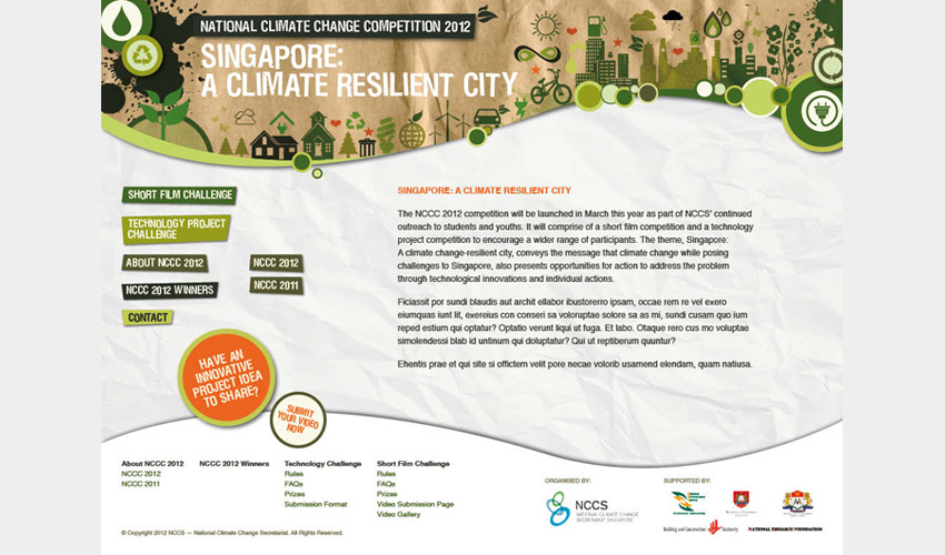
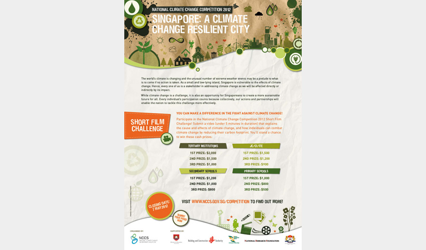
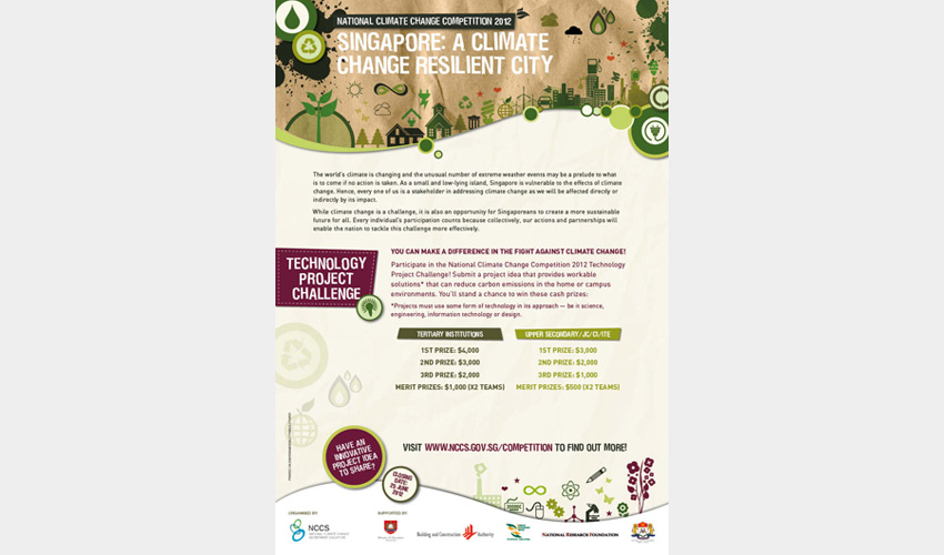
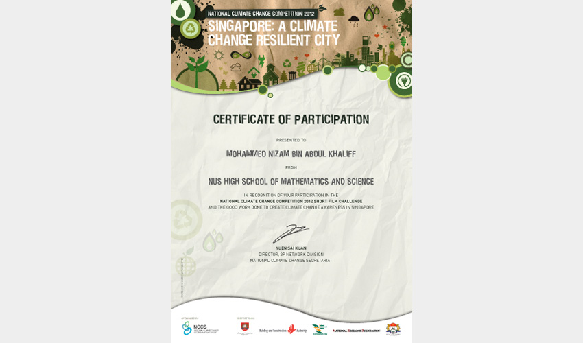
Client
National Climate Change Secretariat
A series of publicity collaterals designed for National Climate Change Competition 2012, targeting students from Upper Secondary to Tertiary level. The design of multiple icons in shades of green appeared on posters, the homepage of website, certificates and trophies.
A collaboration with Behaviour Design Office.
'Love The Life' newsletter (2010 – 2012)
WORK 3
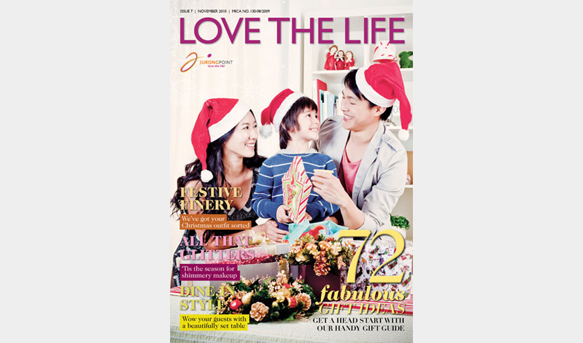
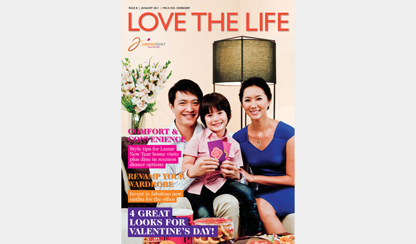
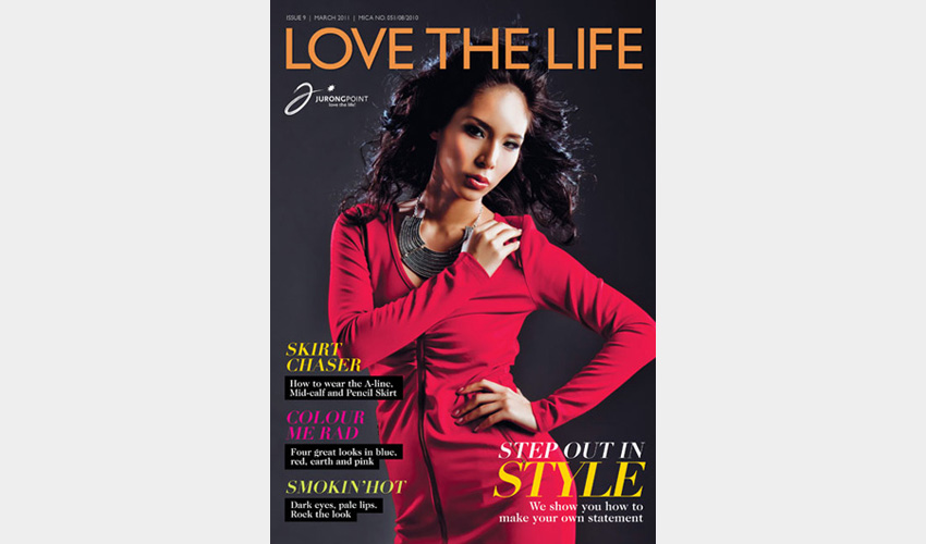
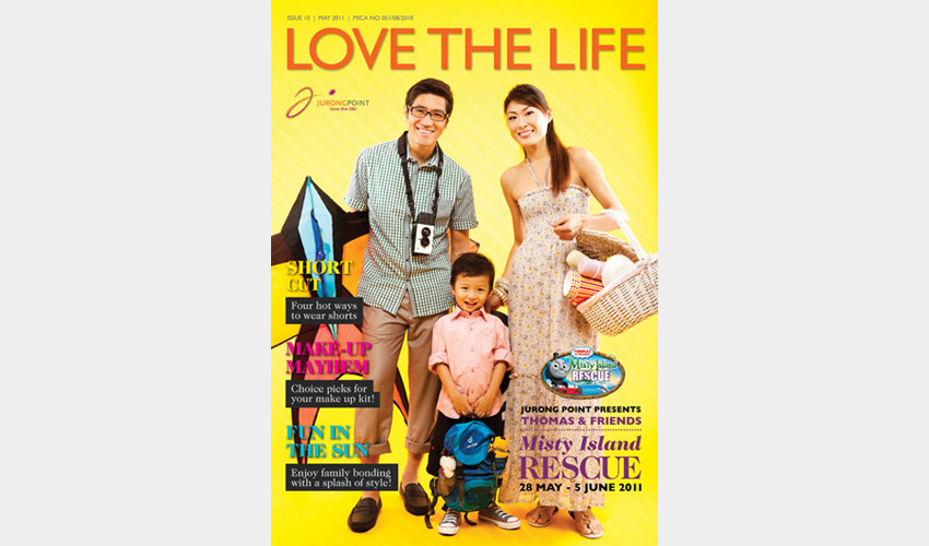
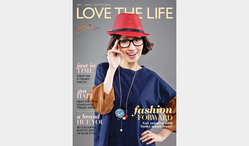
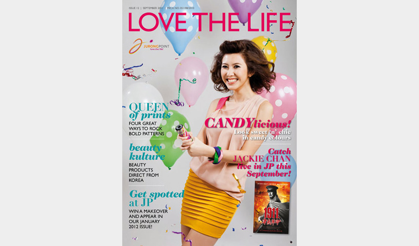
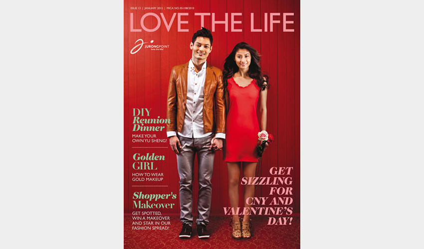
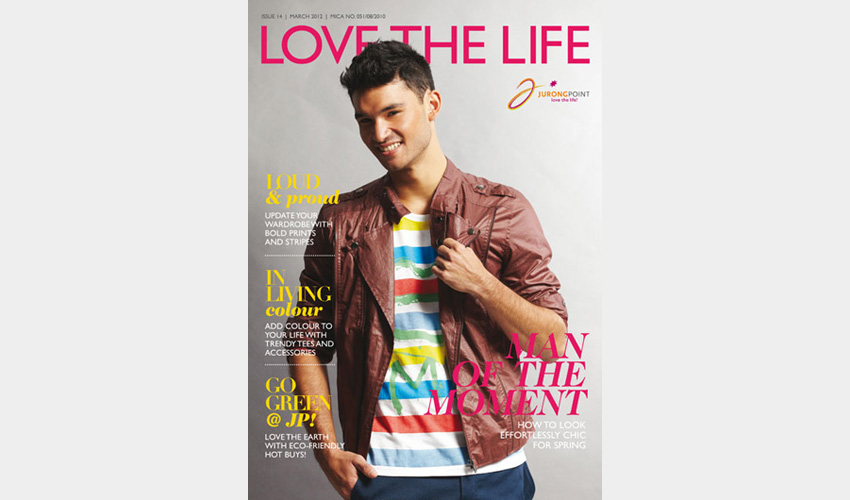
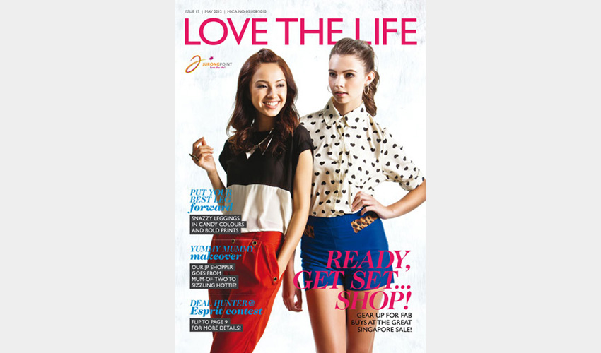
Client
Jurong Point
A bi-monthly lifestyle newsletter for Jurong Point, it contains editorials like style advice, fashion spreads, shopping tips and recipes as well as the latest promotions and happenings. Styled, photographed, written and designed inhouse by the InkEngineers team.
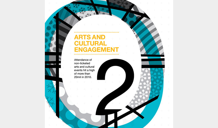
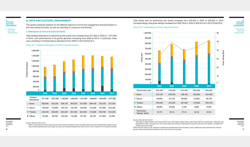
Singapore Cultural Statistics Report 2011
WORK 2
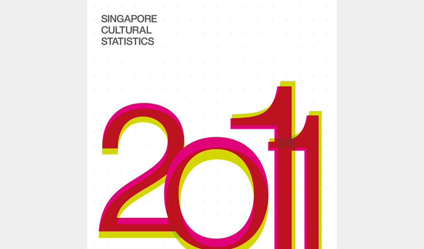
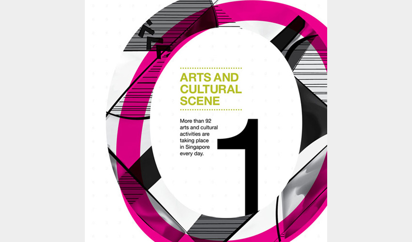
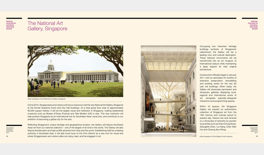
Client
Ministry of Information, Communication and the Arts
A report that analyses Singapore's cultural statistics over the past years, presented mainly in the form of diagrams, charts and graphs. Numbers and patterns are thus used as the key design on the cover and dividers while vibrant colours jazz up the monotony of the statistics.
A collaboration with Behaviour Design Office.
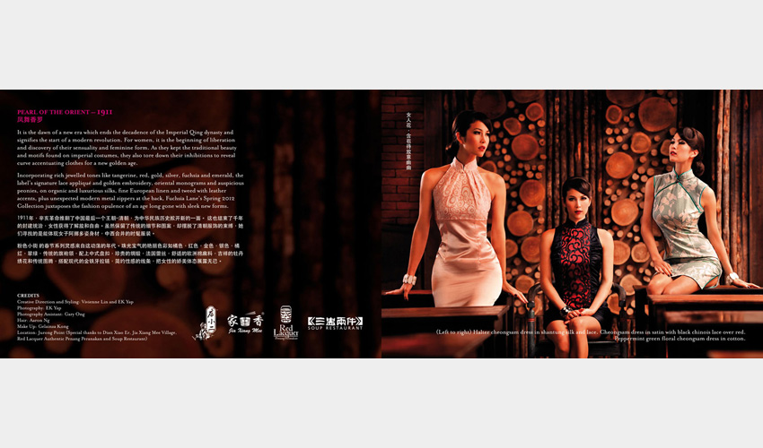
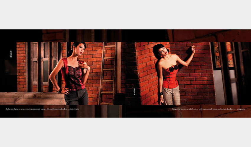
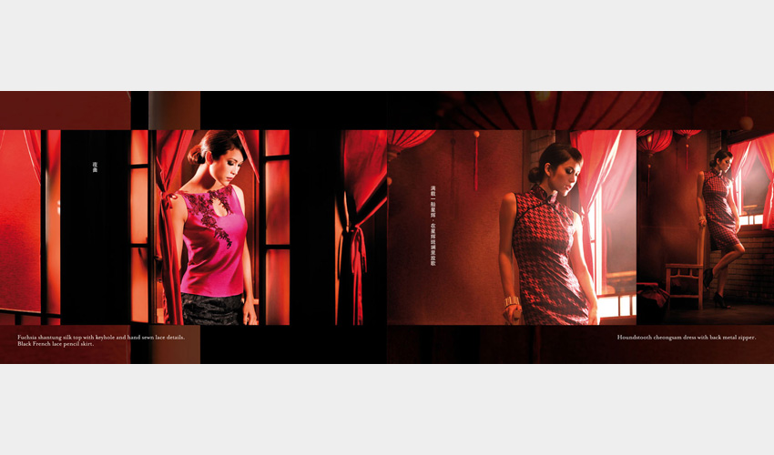
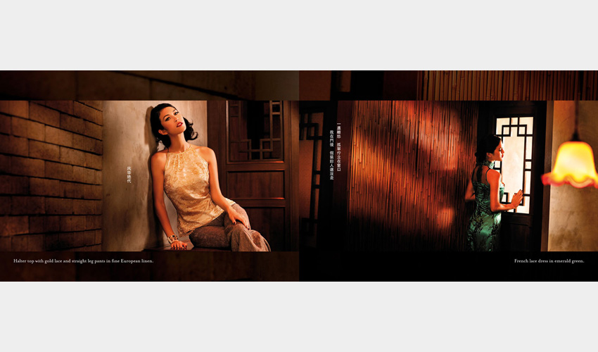
Pearl Of The Orient – 1911 fashion show look book
WORK 1
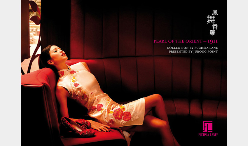
Client
Jurong Point
A look book designed for the Pearl Of The Orient - 1911 fashion show organized by Jurong Point, featuring the Spring 2012 collection by Fuschia Lane. The simple, classy design plays up the rich cinematic images to conjure up old-school glamour.
Collection by Fuschia Lane and organised by Jurong Point.